Webvio Design

World-class digital experiences.

Webvio web development agency team
UI/UX Design & Development 2025

T-Room | Independent News Publishing Platform

A full editorial news website for T-Room, an independent US news platform covering breaking news, politics, finance, international affairs, and national security. Designed in Figma and built on WordPress with Kadence Theme.

Figma UI/UX Design
Kadence Theme Framework
7+ News Categories
Platform WordPress + Kadence Theme
Project Type UI/UX Design (Figma) + Full Development
Year 2025
Category Media / Publishing
The Project

What we built and why

T-Room is an independent US news platform focused on reliable, factually based reporting across breaking news, must-read analysis, national security, international news, finance, and politics. The site also features a dedicated column by journalist Helen Tansey, “Just the Facts.”

The brief was to design and build a news platform that reads clearly, loads fast, and serves a high volume of editorial content without visual noise. We designed the full site in Figma and built it in WordPress using Kadence Theme as the development framework.

The site needed a structured multi-category editorial layout, a featured article hero, dedicated section feeds, an archive system, and a clean mobile reading experience for an audience that reads long-form news content daily.
Stack & Tools

Technologies used

WordPress CMSKadence ThemeFigma (UI/UX Design)Custom CSSCategory Taxonomy ArchitectureCustom Post TemplatesMobile-First Responsive DesignSEO Optimization
Visual Work

The design across all devices

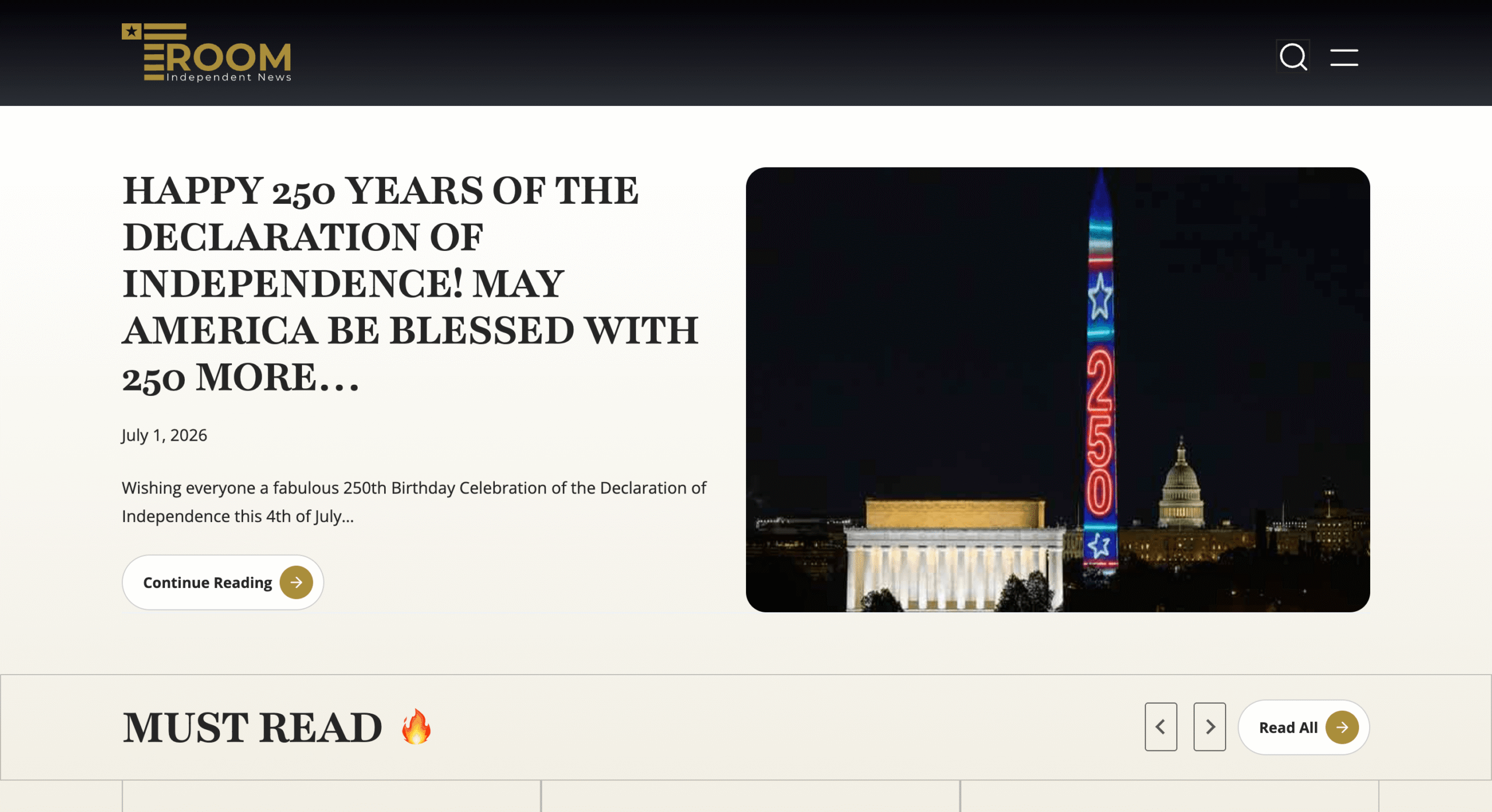
T-Room | Independent News Publishing Platform desktop view
Desktop — 1440px
T-Room | Independent News Publishing Platform tablet view
Tablet — 768px
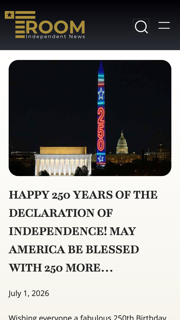
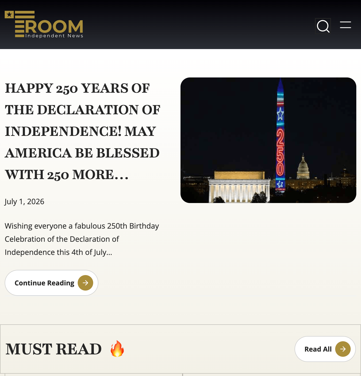
T-Room | Independent News Publishing Platform mobile view
Mobile — 375px
Design Process

How we approached it

T-Room required a design that prioritises readability and content hierarchy above everything else. News readers scan before they read. The layout needed to surface the most important stories immediately, segment content by category clearly, and remove anything that slows down the reading experience.

We designed the full site in Figma covering the homepage, category archive pages, single article template, about page, and contact page. The homepage uses a dominant hero article slot for breaking news, followed by segmented section feeds for Must Read, Just the Facts, and Most Recent News.

The Just the Facts column by Helen Tansey needed its own visual identity within the site. We gave it a distinct section layout with author attribution and a consistent card style that differentiates her content from the broader news feed without breaking the overall design language.

Typography was the primary design tool. Clean serif headings, readable body size, and generous line spacing make long-form articles comfortable to read. The dark footer and header contrast cleanly with the white content body.

Development

Build highlights

01
Multi-Category Editorial Homepage

Built the homepage as a structured editorial layout with a dominant breaking news hero, a Must Read section feed, a Just the Facts author column section, and a Most Recent News grid. Each section pulls from its WordPress category automatically as new articles are published.

02
Kadence Theme Custom Development

Used Kadence as the build framework with extensive custom CSS and template overrides to achieve the precise editorial layout the Figma design specified. The result looks nothing like a standard Kadence site.

03
Just the Facts Author Column

Built a dedicated section and archive for Helen Tansey's Just the Facts column with consistent author attribution, a distinct card layout, and a dedicated category archive page separate from the main news feed.

04
Single Article Template

Built a clean single article template with category labelling, publish date, author attribution, social sharing, and a related articles section at the foot. Optimised for long-form reading with appropriate line length and spacing.

05
OpenGraph and Twitter Card Meta

Configured full OpenGraph and Twitter Card meta tags across all article pages, with thumbnail image, title, description, and category data surfaced correctly when articles are shared on social media.

06
Archive Sites Integration

Integrated footer links to the T-Room archive sites covering 2010 to 2024, giving long-term readers access to historical content without migrating the full archive into the new platform.

Problem Solving

Challenges & solutions

01
Challenge

Organising seven content categories without a cluttered homepage

T-Room publishes across seven categories with overlapping articles. Surfacing all of them on the homepage without it becoming a wall of links required clear visual hierarchy and selective section display.

01
Solution

Prioritised section architecture with category segmentation

We structured the homepage around three primary sections rather than all seven categories. Breaking news takes the hero slot. Must Read and Just the Facts get dedicated section feeds. Most Recent News handles the remaining live content. Category navigation in the header gives readers direct access to any specific section.

02
Challenge

Building a fast, readable news site on Kadence

Kadence is a capable theme framework but its default styles and block patterns needed significant overriding to achieve a clean editorial design. Out of the box it does not produce a news publication layout.

02
Solution

Figma-first design with full Kadence CSS override

The Figma design phase established the exact layout before development started. We then treated Kadence purely as a structural base and overrode the visual layer with custom CSS throughout. Typography, spacing, card layouts, hero sections, and section feeds were all rebuilt to match the design exactly.

Outcome

Results & impact

T-Room launched with a clean, fast editorial platform that handles a high volume of daily publishing across seven categories. The homepage updates automatically as new articles are published, with no manual layout management required from the editorial team.

The Just the Facts column has a clear, consistent home on the platform. Articles share correctly on social media with full OpenGraph metadata. The mobile reading experience is clean and fast for an audience that reads news on phones.

Figma UI/UX Design
Kadence Theme Framework
7+ News Categories
US Independent News
Takeaway

Final thoughts

T-Room needed a news platform that reads clearly and loads fast. Figma design and Kadence development delivered both without compromise.

News sites have one job: get readers to the content fast. Every design decision on T-Room served that goal. Clean typography, structured section feeds, a dominant hero slot, and a fast Kadence build give the editorial team a platform they publish to daily without any friction. The Figma-first process meant the layout was agreed before development, and the build matched the design exactly.

Next Project

SLIBS | Industrial Safety & Quote Request Platform

View Case Study
SLIBS | Industrial Safety & Quote Request Platform Next →