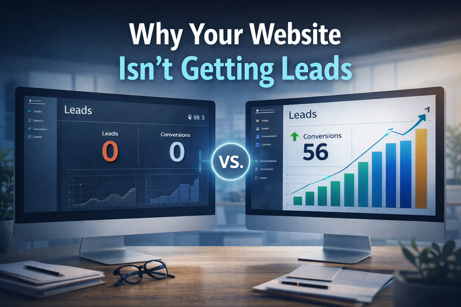
Your homepage has one job: grab attention and guide visitors toward taking action. But most business websites fail at this within the first five seconds. Visitors land, scan the page, find nothing that speaks to them, and leave — often never coming back.
The frustrating part is that most of these failures come down to the same repeatable mistakes. They have nothing to do with how the site looks and everything to do with how it’s structured, what it says, and what it asks visitors to do next.
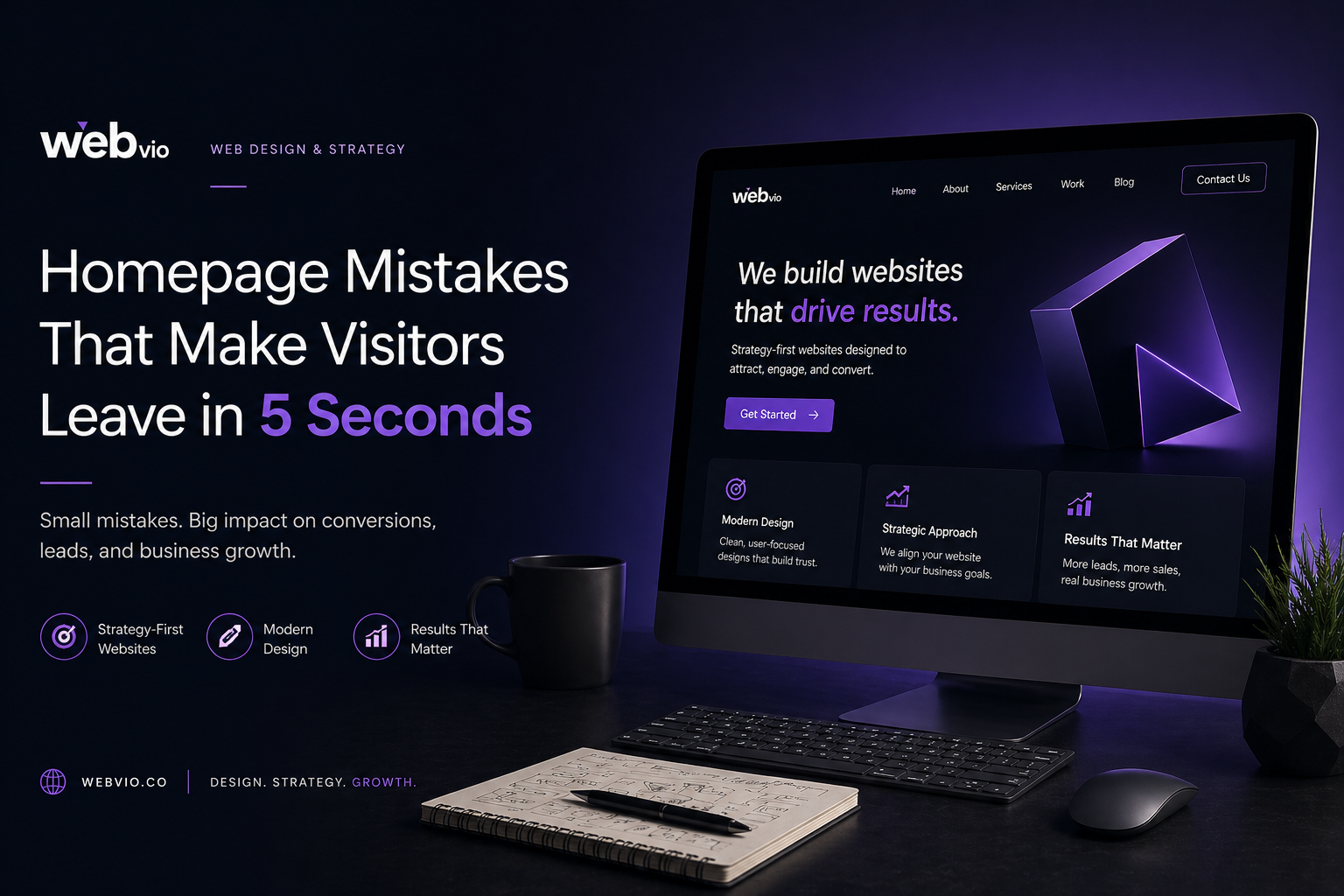
Here are the 10 most common homepage mistakes that drive visitors away — and exactly how to fix each one.
1. No Clear Value Proposition
When someone lands on your homepage for the first time, they make a judgment in under five seconds. The single question in their head is: “Is this for me?” If your headline doesn’t answer that clearly and immediately, they leave.
Most homepage headlines fail because they describe the business rather than the outcome the visitor gets. “We are a full-service digital agency” tells a visitor nothing about whether you can solve their problem. “We build websites that generate leads for US service businesses” tells them everything they need to know in one sentence.
Your headline should answer three things at once: what you do, who it’s for, and what result it delivers. If you need more than one sentence to answer all three, your value proposition needs work.
Fix: Rewrite your hero headline as an outcome, not a description. Test it by asking someone who doesn’t know your business to read it and tell you what you do in their own words. If they can’t, rewrite it.
2. Too Much Focus on Design, Not Strategy
A homepage that wins design awards but generates no leads is a failure. Design is not the goal — conversion is. When businesses spend 80% of their website budget on making things look beautiful and 0% on thinking about user flow, the result is a site that impresses but doesn’t convert.
Every design decision on your homepage should serve a strategic purpose. The color of your CTA button, the order sections appear in, which elements appear above the fold — these are strategic decisions, not aesthetic ones. Good design makes the strategy invisible. Bad design makes the strategy irrelevant.
Fix: Before your next redesign, map out the journey you want visitors to take from the moment they land to the moment they contact you. Every section should move them one step closer to that action. If a section doesn’t serve that journey, cut it.
3. Weak or Missing Call-to-Action
The most common CTA mistake is having one but making it easy to ignore. A small “Contact Us” link in the navigation bar is not a call-to-action. It’s an afterthought. Visitors don’t hunt for ways to reach you — if the next step isn’t obvious and compelling, they won’t take it.
The second most common mistake is having too many CTAs that compete with each other. When everything is clickable, nothing stands out. Your homepage should have one primary CTA that appears multiple times — above the fold, after your services section, and again at the bottom of the page.
Fix: Make your primary CTA a button, not a link. Use specific action language — “Book a Free Strategy Call” converts better than “Contact Us” because it tells the visitor exactly what happens when they click. Place it above the fold where it’s visible without scrolling.
4. Slow Loading Speed
Page speed is not just a technical metric — it’s a conversion metric. Research consistently shows that for every additional second a page takes to load, conversion rates drop by roughly 7%. On mobile, visitors are even less patient. A homepage that takes 4 seconds to load on a phone will lose the majority of mobile visitors before they see a single word.
Google also uses page speed as a ranking factor through Core Web Vitals. A slow homepage doesn’t just lose visitors — it loses rankings, which means fewer visitors find you in the first place. The two problems compound each other.
Fix: Run your homepage through Google PageSpeed Insights right now. If your mobile score is below 70, it needs immediate attention. The most common culprits are uncompressed images, too many plugins, and no caching setup. A properly built custom website should score above 85 on both mobile and desktop.
5. Cluttered Layout With Too Many Elements
More information does not mean more conversions. When a homepage tries to say everything at once — every service, every feature, every achievement, every testimonial on one page — visitors experience decision paralysis and leave without doing anything.
The homepage is not the place to tell your complete story. It’s the place to tell enough of your story that visitors want to learn more. Every element that doesn’t contribute to that goal is diluting the ones that do.
Fix: Apply a simple test to every section of your homepage: does this move the visitor closer to contacting me? If the answer is no, or not clearly yes, consider removing it or moving it to an internal page. White space is not wasted space — it’s what makes the important elements stand out.
6. No Trust Signals
A visitor who finds your homepage through a Google search knows nothing about you. They have no reason to trust you yet. If your homepage doesn’t give them evidence that others have trusted you — and that it worked out — they’ll find someone whose homepage does.
Trust signals include client logos, testimonials with real names and companies, case study results, review platform ratings, years in business, number of projects completed, and any press mentions or certifications. The more specific these are, the more effective they are. “Great work!” from “John D.” is almost worthless. “Our inbound leads increased by 40% in the first 3 months” from “Sarah Mitchell, CEO of Clarity SaaS” is powerful.
Fix: Add at minimum three testimonials to your homepage that include the client’s full name, company, and a specific result. If you have client logos, add a logo bar. If you have Clutch or Google reviews, link to them. Specificity is everything — vague praise helps no one.
7. Poor Mobile Experience
Over 60% of web traffic now comes from mobile devices. Despite this, a huge number of business websites treat mobile as an afterthought — designing for desktop first and then squeezing it down for phones. The result is text that’s too small, buttons that are too close together, and images that break the layout.
A poor mobile experience doesn’t just frustrate visitors — it signals to Google that your site isn’t high quality, which suppresses your rankings in mobile search results. This affects the majority of your potential audience.
Fix: Open your homepage on your own phone right now. Can you read the text without zooming? Are the buttons easy to tap with your thumb? Does the page load in under 3 seconds on mobile data? If the answer to any of these is no, your mobile experience needs work before anything else.
8. Generic Content That Speaks to No One
Generic homepage copy is the most invisible problem on this list because it looks fine on the surface. “We deliver high-quality solutions tailored to your needs” sounds professional. But it says nothing, differentiates you from nobody, and connects with no one.
Visitors come to your homepage with specific problems. They want to know that you understand their situation better than they do. Generic content tells them you don’t know who they are. Specific content — written for a defined audience with specific pain points — makes them feel like you’re reading their mind.
Fix: Rewrite your homepage copy with a specific type of client in mind. What industry are they in? What problem are they trying to solve? What have they tried before that didn’t work? Write to that person. If your copy would work on any competitor’s website without changing a word, it’s too generic.
9. No Visual Hierarchy
Visual hierarchy is what tells a visitor’s eye where to look first, second, and third. When everything on a page is the same size, same weight, and same importance, visitors don’t know where to focus — so they focus on nothing and leave.
The most important message on your page should be the largest and most prominent. The second most important should be clearly subordinate to it. Supporting elements like body copy and secondary information should recede visually. This creates a natural reading flow that guides visitors through your message in the order you intend.
Fix: Look at your homepage and squint until everything blurs slightly. The elements that still stand out are the ones with visual hierarchy. The elements that disappear are the ones that aren’t performing their job. Your headline, primary CTA, and key benefits should always stand out. Everything else should support them.
10. No Clear Offer Above the Fold
Visitors make decisions quickly. If the value exchange isn’t clear in the first screen they see — what you’re offering and what they need to do to get it — most won’t scroll to find out. Your above-the-fold content needs to make the offer obvious.
This doesn’t have to be a discount or a free trial. For service businesses, the offer might be a free consultation, a free audit, a strategy call, or even just a clear explanation of your process. The point is that visitors need a reason to take the next step now, not later.
Fix: Make sure your above-the-fold section contains your headline, a one-sentence description of who you help and how, and a primary CTA with a specific offer. Visitors should be able to understand your offer and know exactly what to click without scrolling at all.
Final Thoughts
Your homepage is not a digital brochure. It’s the first conversation your business has with every potential client who finds you online — and like any first conversation, you get one chance to make the right impression.
The good news is that none of these mistakes are difficult to fix once you know they exist. Most of them come down to clarity: being clearer about who you help, what you offer, why visitors should trust you, and what they should do next.
Fix these ten mistakes and you’ll see measurable improvements in time on page, scroll depth, and most importantly — the number of visitors who actually reach out.
If you’re not sure which of these is hurting your site most, the fastest way to find out is a proper homepage audit.