Your website might look good — but if visitors aren’t turning into leads, enquiries, or sales, it’s failing at its only real job. A website that doesn’t convert is an expensive placeholder, not a business asset.
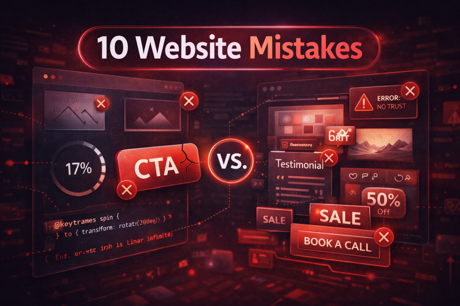
The frustrating truth is that most conversion problems come from the same handful of mistakes. They’re not complicated to fix, but they’re easy to miss when you’re too close to your own site. Here are the 10 most common website mistakes that kill conversions — and exactly what to do about each one.
1. Slow Loading Speed
Speed is the foundation everything else is built on. It doesn’t matter how well-designed your site is or how compelling your offer is — if the page takes more than 3 seconds to load, a significant portion of your visitors will leave before they see any of it.
Google’s research shows that as page load time increases from 1 second to 3 seconds, the probability of a visitor bouncing increases by 32%. From 1 second to 5 seconds, that probability jumps to 90%. On mobile — where over 60% of web traffic now comes from — the situation is even worse because connections are slower and users are even less patient.
Speed also directly affects your Google rankings through Core Web Vitals. A slow site doesn’t just lose the visitors it gets — it gets fewer visitors in the first place because it ranks lower in search results.
Fix: Run your site through Google PageSpeed Insights today. Target a score above 85 on both mobile and desktop. The quickest wins are usually compressing images, removing unused plugins, enabling browser caching, and switching to faster hosting. A properly built custom website should load in under 2 seconds on desktop and under 3 seconds on mobile.
2. Weak or Missing Call-to-Action
A call-to-action is not a “Contact” link in your navigation menu. That’s an afterthought visitors have to hunt for. A real CTA is a prominent, visually distinct button with specific language that tells visitors exactly what happens when they click it — and gives them a reason to click it now rather than later.
The two most common CTA mistakes are making it too easy to ignore and using language that’s too vague. “Submit” and “Click Here” tell visitors nothing. “Book a Free 30-Minute Strategy Call” tells them exactly what they’re getting, how long it takes, and that it costs nothing. Specificity always converts better than vagueness.
The other mistake is having only one CTA on the entire page. Visitors who reach the bottom of your page without converting are still interested — they just need another prompt. Place your primary CTA above the fold, again after your main services or benefits section, and once more at the bottom of the page.
Fix: Replace vague CTA language with specific action language. “Get a Free Quote”, “Book a Strategy Call”, and “Start Your Project” all outperform “Contact Us” because they set expectations. Make the button visually distinct from everything else on the page — it should be impossible to miss.
3. Poor Mobile Experience
More than 60% of web traffic globally comes from mobile devices, yet the majority of business websites are still designed desktop-first. The result is a mobile experience full of text that’s too small to read, buttons that are too close together to tap accurately, and images that break the layout on smaller screens.
A poor mobile experience doesn’t just frustrate visitors — it signals poor quality to Google, which suppresses your rankings in mobile search results. Since most searches now happen on phones, this is a ranking problem as much as it is a UX problem.
Fix: Open your website on your own phone right now and try to complete a task — find a service, read about your process, and submit a contact form. If anything feels difficult, slow, or broken, fix it before investing in anything else. Every tap target should be at least 44px, every font should be readable without zooming, and the page should load in under 3 seconds on a standard mobile connection.
4. Confusing Layout and Page Structure
Visitors don’t read websites — they scan them. Research from Nielsen Norman Group consistently shows that users spend the majority of their time looking at the left side of the page and scanning in an F-shaped pattern. If your most important information isn’t positioned where their eyes naturally go, most visitors will miss it entirely.
A confusing layout is one where visitors can’t immediately answer these three questions: What does this business do? Is this relevant to me? What should I do next? If any of those answers require more than a few seconds of reading and scanning, your layout is working against you.
Fix: Structure every page with the most important information first and a clear hierarchy from there. Your headline answers what you do. Your subheadline addresses who it’s for. Your first section explains the main benefit. Then supporting sections build the case, and a CTA closes it. Remove anything that doesn’t contribute to moving the visitor through that sequence.
5. No Clear Value Proposition
Your value proposition is the single most important piece of copy on your website — and most businesses get it wrong. The most common mistake is describing what your business is instead of what your client gets. “Full-service digital agency with 10 years of experience” is about you. “We build websites that generate consistent leads for US service businesses” is about the client.
Visitors decide within 5 seconds whether your site is relevant to them. If your headline doesn’t immediately answer “what’s in it for me?”, they’ll leave and try the next result. In competitive markets, a weak value proposition is as damaging as no value proposition at all — because it fails to differentiate you from the dozens of competitors saying essentially the same thing.
Fix: Rewrite your main headline as an outcome statement. What does your best client walk away with after working with you? Lead with that. Test it with someone who doesn’t know your business — ask them to read your homepage headline and tell you what you do in their own words. If they can’t, rewrite it until they can.
6. Lack of Trust Signals
When a visitor finds your website through a Google search, they know nothing about you. They have no existing relationship with your business and no reason to trust you by default. If your website doesn’t proactively build trust, visitors will default to safer choices — like the competitors with more visible social proof.
Trust signals include testimonials with real names and companies, client logos, case study results with specific numbers, review platform ratings, years in business, number of clients served, certifications, and any media mentions. The more specific these are, the more effective they are. A testimonial that says “Highly recommend!” from “Sarah M.” is nearly worthless. One that says “Our leads increased by 60% in the first two months” from “Sarah Mitchell, CEO of Clarity Consulting” is genuinely persuasive.
Fix: Add at least three testimonials to your homepage that include the client’s full name, their company or role, and a specific outcome they experienced. If you have client logos, add them in a dedicated section. If you have Clutch, Google, or Trustpilot reviews, link to them. Every piece of third-party validation you add reduces the perceived risk of reaching out.
7. Too Many Distractions
Every element on your website is competing for your visitor’s attention. When too many things compete at once — multiple popups, auto-playing videos, aggressive animations, five different CTAs, chat widgets, cookie banners, and newsletter sign-up forms all on the same page — visitors experience cognitive overload and disengage entirely.
More features and more elements do not mean more conversions. In most cases, the opposite is true. The highest-converting pages are often the simplest ones — a clear headline, a focused benefit statement, one primary CTA, and enough supporting information to build confidence. That’s it.
Fix: Audit every element on your homepage and ask: does this help move the visitor toward contacting me? If the honest answer is no or maybe, remove it. Particular culprits include exit-intent popups, auto-play media, excessive animations that don’t serve the content, and multiple competing CTAs. Give your primary CTA room to breathe.
8. Poor Navigation
Navigation is how visitors find what they need — and when it’s confusing, they don’t find it. They leave instead. The most common navigation mistakes are having too many items in the menu, using clever or branded labels that visitors don’t understand, and burying important pages too deep in dropdown menus.
Your navigation should reflect what visitors are looking for, not how your business is internally organized. Most visitors to a service business website are trying to find out what you do, see examples of your work, understand your pricing, and figure out how to contact you. Your navigation should make all four of those things findable in one click.
Fix: Limit your main navigation to 5-6 items maximum. Use plain language labels that match what visitors would search for — “Services”, “Work”, “Pricing”, “About”, “Contact”. If you have many services, group them under one dropdown rather than listing every single one in the top nav. Put your CTA button in the top right corner of the navigation where visitors expect to find it.
9. No SEO Foundation
A website with no SEO optimization is invisible to the majority of potential clients. When someone in your target market searches Google for the service you offer, your site needs to appear in the results — or that visitor will find a competitor instead. SEO isn’t optional for a business website; it’s the difference between a site that generates leads and one that doesn’t.
Basic on-page SEO is not complicated, but it’s routinely neglected. Missing meta titles and descriptions, heading tags used incorrectly, no schema markup, pages with duplicate content, and no sitemap submitted to Google Search Console are all problems that prevent your pages from ranking — even if the content itself is excellent.
Fix: Every page on your website should have a unique meta title under 60 characters, a meta description under 160 characters, one H1 heading that includes your target keyword, and clean semantic HTML structure with proper H2 and H3 subheadings. Submit your sitemap to Google Search Console and check the Pages report monthly to make sure your key pages are indexed. These fundamentals alone will put you ahead of most competitors.
10. No Conversion Strategy
The final and most costly mistake is treating your website as a passive brochure instead of an active sales system. A brochure presents information and waits. A sales system guides visitors through a deliberate sequence designed to build trust, communicate value, and make taking the next step feel obvious and low-risk.
Most business websites have no conversion strategy. Pages are created because they seem like they should exist, not because they serve a specific role in moving visitors toward becoming clients. There’s no thought given to what a visitor who isn’t ready to buy yet should do, how to capture leads from visitors who won’t fill out a contact form, or how to follow up with people who showed interest but didn’t convert.
Fix: Map out the journey a typical client takes from first discovering your business to paying you. Then look at your website and ask honestly whether it supports that journey at every stage. Add a low-friction entry point for visitors who aren’t ready for a full consultation — a free audit, a downloadable guide, or a short quiz. Give visitors who aren’t ready to commit today a reason to leave their email address so you can follow up.
Conclusion
These ten mistakes share one thing in common: they all get in the way of the relationship between your website and your visitor. Fix them and you don’t just improve your conversion rate — you improve the experience of every person who finds your business online.
The best part is that most of these fixes don’t require a full redesign. Many of them — rewriting your CTA, adding testimonials, fixing your mobile layout, submitting your sitemap — can be done this week. Start with the ones that apply most clearly to your site and measure the impact before moving to the next.
If you’re not sure which of these mistakes is costing you the most leads, a proper website audit will show you exactly where visitors are dropping off and what to fix first.